I love level design and how fascinating it can be from a subconscious/psychological perspective; I always find it interesting how you can lead the player into making a certain choice or path and try to make it feel as though it was their own decision as opposed to the feeling of being handheld through a level.
The task was to create a simple level composed of a maximum of three rooms and one corridor. I spoke with my tutor to discuss what would define a corridor which led to quite an interesting conversation. It helped me to think outside of the box and experiment a little more with the concepts I had in my head.
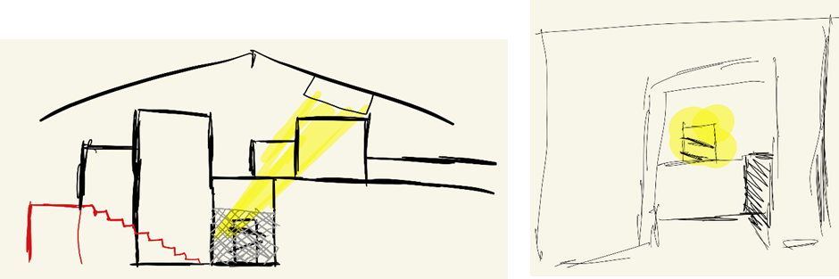
I immediately opened paint and began using the drawing tablet to sketch out a quick image I had in my head of what the level would look like from the player’s perspective. The player would be standing on a metal walkway inside a large warehouse which houses a large obstacle. I chose to have a position like this so that the player had an overview of the level and their goal in sight immediately, I liked this idea initially and continued with it.
I began drawing out a top-down view with a yellow-coloured ‘level flow’ arrow showing where I intend for the player to go. The small ovals/circles near walls indicate doors. The yellow circle/highlight over the door on the right is to signify the light breaking through the broken ceiling
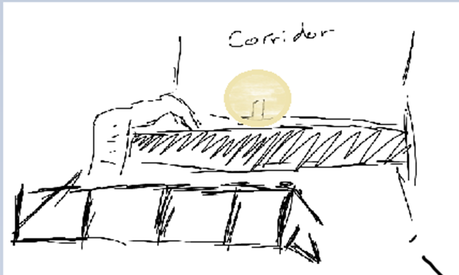

I decided to try and utilise the light coming from the ceiling to draw the player’s attention towards it, contrasting it to the darkness of the room I intend for them to be in, it would be a nice signal towards their freedom or hope.
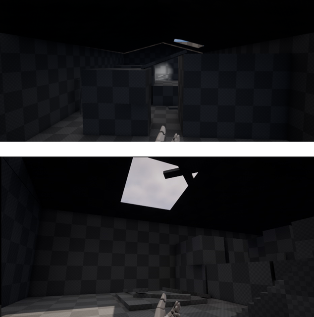
I showed this to my tutor and got some positive feedback, I felt I was ready to begin blocking it out using BSPs in UE5. I started by building out the main entrance area, the first place the player would see. I made sure to understand the scale of everything in this area and from there I could continue with the same scale in mind. Here I made use of the subtraction aspect of the BSP functionality to create a window.
Once I had finished the first room, I then began working on the main Warehouse, I decided to use this as the corridor as it is just defined as a space you move through to get to another place.
It was at this point that I began straying from my initial idea about the warehouse, I felt it was too simple and that it was honestly just quite unimaginative and empty.
I played around with the idea of changing the whole concept to it being an underground ancient maze that the player has to fix and solve, picking up a lever halfway through and delivering it to a broken switch to open up a new area.
-The red triangle shows where the player will begin
-The Yellow squares will be walls that can be moved using a switch found at the entrance
-The green ovals show the different ways out of the maze.
The exit on the left would let the player discover the lever they need, they would then need to return through the maze to the beginning to fix the switch, activate it, then go back through the maze and resolve it to figure out the new exit.

I began blocking this idea out using BSPs in UE5 but halfway through realised that I was just overcomplicating it now. I tried so hard to make it a little more impressive and intricate and I completely strayed away from my initial idea. It no longer mattered that the warehouse even existed in all honestly, as you were stuck in a maze the whole time, which is effectively the same dimensions as an average corridor anyway.
My idea had devolved back into what I didn’t want it to be.
So, I took a day’s break and had a reset. I went back and rewatched a talk from Peter Fields I had seen online regarding level design.
As well as being a great refresher to rewatch, it also gave me a massive insight into how industry-standard levels are designed and thought through, each part of the process from the initial concept, to making the player make choices, guiding them towards where you want to take them organically and designing spaces with assets/room purpose in mind.
I then reworked my first idea, and added to it, instead of throwing it out completely. I decided that instead of a machine in the middle, I would instead use cargo containers, they would make more sense to be in a warehouse, and they would be pretty easy to utilise in other areas of the map to block off certain areas from view at different perspectives. Not to mention that they’d also be a lot easier to source in an asset pack.
The images above were some new perspective/orthographic images I made of the level design, specifically the view I wanted the player to have when entering the level for the first time. I decided to go with a blend of the two. Below is how the final block out ended up looking.
Various aspects of this level aimed to incorporate an aspect of environmental storytelling. I wanted the player to explore the level, and wonder where the light was coming from, then see the broken roof and realise that this place is abandoned or heavily damaged.
Whilst designing the level I found myself thinking about a lot of source engine games (Games made using Valve’s Source engine) like The Stanley Parable, or Portal, not that I’m comparing my simple block out to how good those games were, but more so the feeling you have when you wander around the level, an uneasiness.
I then sought out some feedback from someone else on the course. Adam Ford played my level a few times and I asked him to vocalise his thought process as he played through the level, so I could almost get a live debug of a player’s mind as they’re experiencing the level, even things as simple as ‘Stairs over there’ or ‘I should open that door’ helped me out a lot with designing this level.
They also highlighted how the placement of certain planks helped to draw their attention to certain areas. This is something I was particularly happy they noticed as I placed most of the planks in the level with that intention.
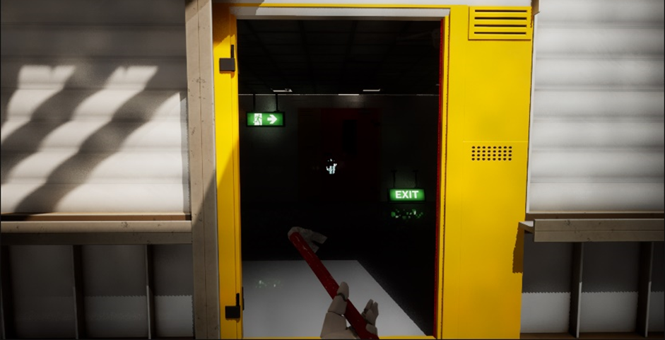
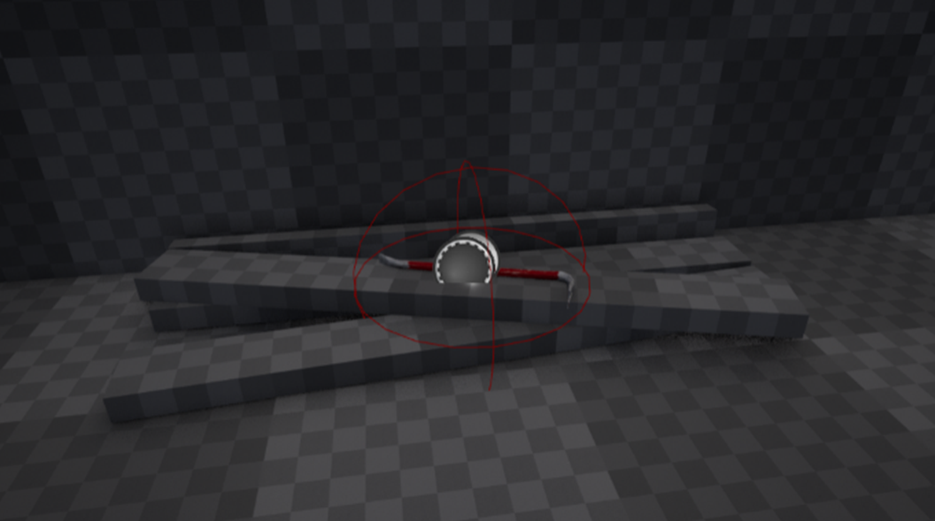
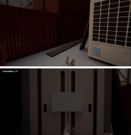
It was then time to implement some form of gameplay. The idea I had for the door at the end was for it to be boarded up. The player would then have to find a crowbar in another room to get the boards off the door.
Beside is an image of where the player will find the crowbar.
In theory, the player should find this room after seeing the boarded-up door, and so after seeing the crowbar atop a pile of other planks, will hopefully make the connection that they need to use it to open the door.
I want to try to communicate as much information as possible without any need for UI popups. In the test runs I did with Adam he worked out the crowbar element pretty quickly, although I have had issues implementing it successfully.
Now was the time to begin finding assets. I checked online to find a crowbar asset and found the perfect one by “HuNtEr_3DdD” on TurboSquid.
I then checked on the Epic store to see if I could find a factory asset pack or warehouse building, and thankfully I had gotten a free factory pack some time ago from an Epic ‘free for the month’ sale. It was exactly what I needed, it had shipping containers, stairs, doors, walls etc. It was posted by Denys Rutkovskyi who works for http://www.artcore-studios.com on the Epic Games Unreal Marketplace.
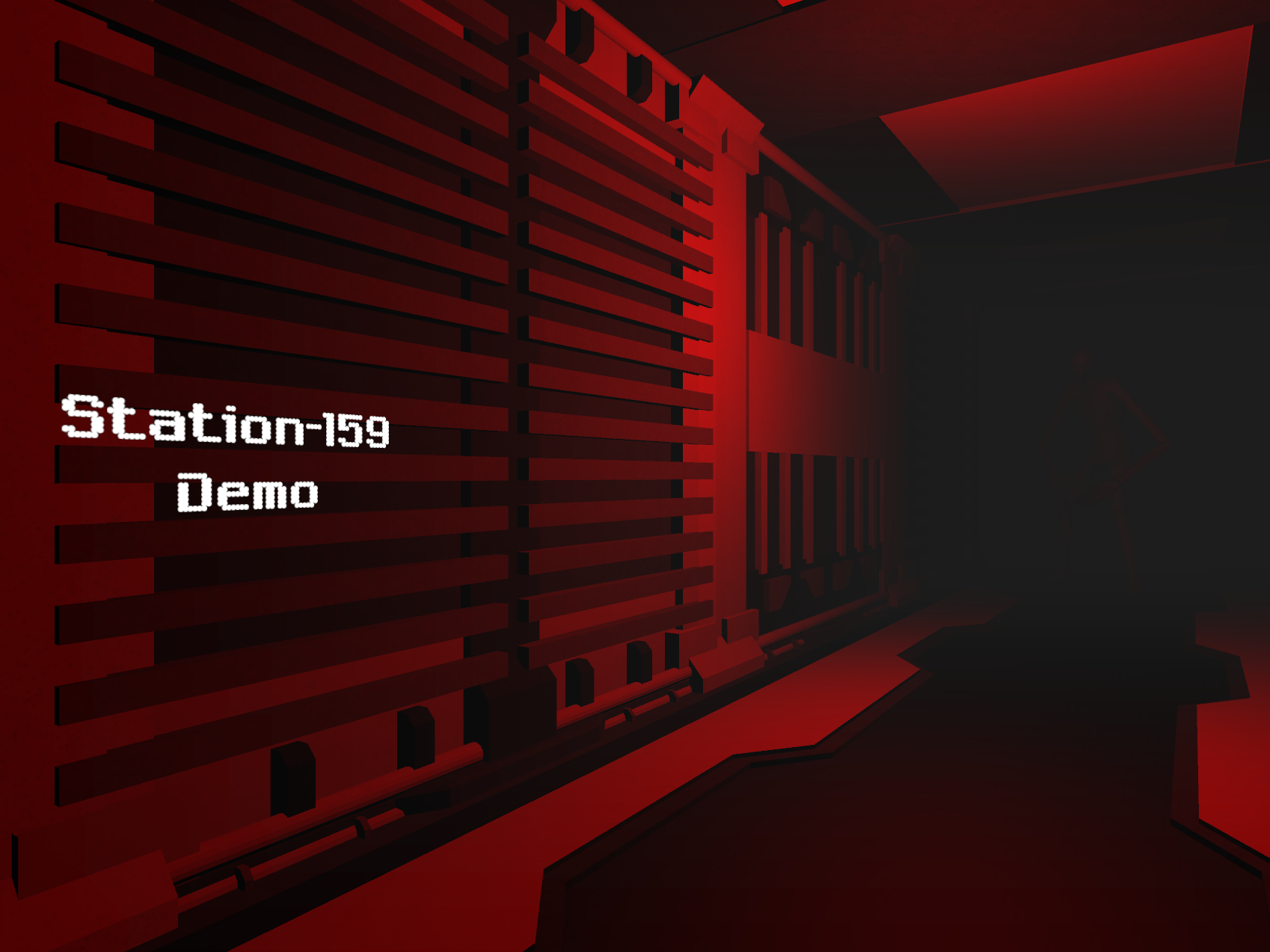
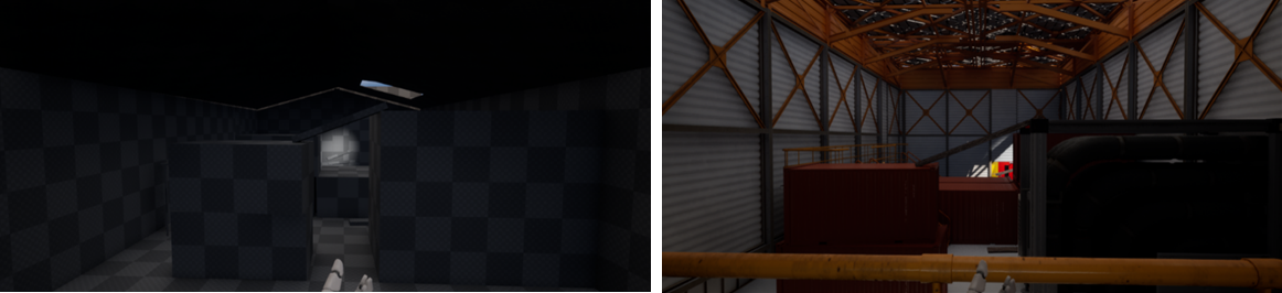
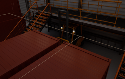
After some hours of tinkering and placing items I had finally created the asset-filled version of the level I had initially blocked out, I have kept each version I tried to make within the same map so that I could easily highlight changes and also for anyone looking, they can easily compare the different iterations, it was also helpful when doing playtesting to quickly go between each level and compare the experiences. Below was the final outcome of the initial opening of the warehouse.
Focusing on retaining the elevated position and allowing the player to have their goal in sight, by utilising the surrounding objects to frame it, and explore to find the route towards it. Purposely obstructing the player's view of the route to get there would incentivise them to explore and discover it.
A before and after of the blockout vs the asset version.
Filling the initial room with assets was a little harder, as there weren't any good window meshes as a part of the asset pack I got, so instead I ditched the window and went for a more sterile, uncanny sort of eeriness throughout.
The available assets changed the feeling I was going for initially.
A helpful note that I picked up from some of the lectures was to utilise other objects and scenery to mask any seams or errors in the map.
Here I hid the seam of the different floor meshes underneath and around the more cluttered area of the map. Mostly entirely obstructed to the player.
Although it wasn’t part of the project requirements, I still took the time to implement a collectable system in the level. I tried using the planks again to lure the player towards it, but only if they wanted to.
If the player wishes they can explore this small pocket of the map and find a small scrap of paper that will disappear and credit them in the UI.
I initially had the interact system have a UI popup to signal to the player that there was something they could pick up, but due to the system using collision boxes instead of ray casts or line traces the player could be looking somewhere completely irrelevant and pick up the collectable without even realising what they just pressed E for.
I tried to get the crowbar to work, I created a socket on the first-person arms and edited the preset animations to better reflect someone holding a single-handed object, but whenever I would save a quit the animations would all reset, and the crowbar, instead of just snapping to the hand that the socket was ‘connected’ to, instead would teleport to the centre of the character and shoot them into space. In a quick fix I just disabled collisions for the crowbar BP, however, this didn’t solve the snapping/socket issue, it did fix the flying issue however which was the one positive.
I decided to completely reapproach how I wanted to get the crowbar working. Instead of handling everything in the player blueprint, I will instead opt to handle it in a 50/50 manner, however instead of snapping the crowbar to the player, I've found that it may be easier to have another crowbar mesh as a part of the playerBP but at a scale of 0, practically invisible to the player, and once the player decides to pick up the crowbar it will destroy the BP on the ground, but as its final action will send a message to the BPI, the BPI will then shoot a message over to the first-personBP and tell it to set the scale to 1. From the player’s perspective, they have just picked up the crowbar, but really it's something that just about gets the job done and tricks them. It's not very clean, but it's just a level demo.
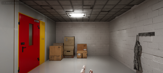
I then began working on the final room, I didn’t have too many ideas honestly, and this ominous, dark room I felt was quite an effective way to finish off the level to an extent. It continues the eeriness that I have been implementing throughout and also very visibly signals to the player that they have found their exit. They completed the puzzle and now they get their prize.
I then added a quick end screen. I made a new map so the background was dark, then threw in an exit sign mesh as I felt it matched the general feeling of the exit within the level.
I wanted to keep the UI minimal similar to the level, because of this I just opted for a simple ‘The End’ and a couple of buttons that were the most helpful ones I could think of with the time remaining.